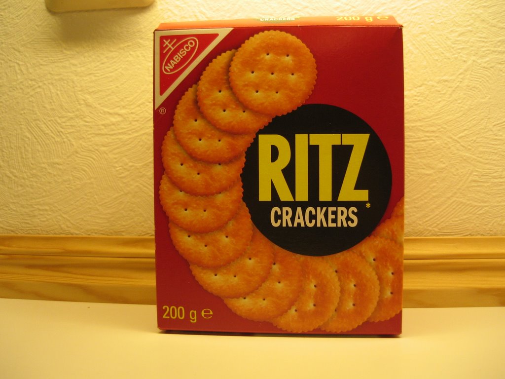
 Ritz's design is timeless in its two dimensional minimalism. Observe the hyper-real photographic rendering of the crackers. The stark yellow on black lettering of the inner circle has been stylistically superimposed over the crackers on the bottom half , while the crackers on the top half appear to be cut out above it. This inconsistency is an enigma whose significance keeps my awake at night. The red box screams for attention.
 Heinz uses a translucent bottle to produce its red backdrop. Its cleverly shaped white label with a green and gold border to symbolize health and wealth obscure the fact that this delightful condiment contains mostly sugar and salt.
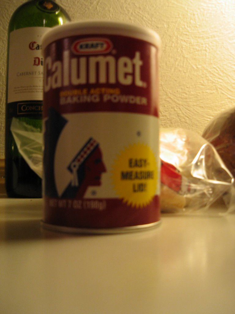 Kraft's Calumet baking powder mixes heavy duty industrial design with the profile of a Native American chief wearing full headdress. To my knowledge, the Native American macrobiotic diet required little use of baking soda. Again, this product uses the color red. I have not determined what is so special about the so-named "EASY-MEASURE LID!" that makes it worthy of an exclamation point.
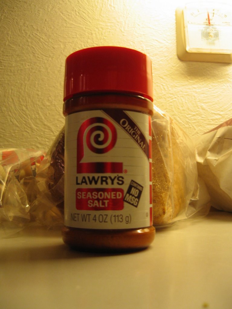 Lawry's maintains our theme of red product design. Its highly stylized "L" is the focal point of this otherwise informational label, which effectively communicates that this product contains no MSG and is "original."
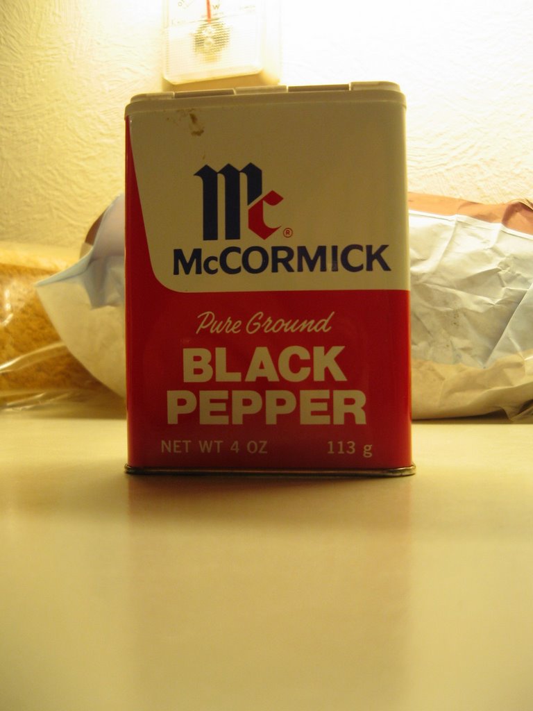
 McCormick uses more fonts than a ransom note in its classic and timeless red and white packaging that communicates with a retro and feel-good wholesomeness: we are not adulterated by trends or fads.
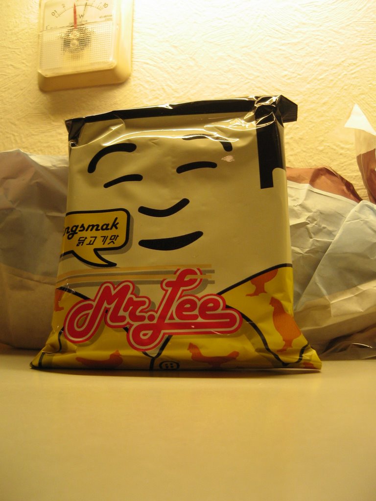
Mr Lee ramen noodles proves that using a 70s font and shallow Asian stereotyping need not adversely affect a packaging project.


1 comment:
Nice post thanks forr sharing
Post a Comment